SOCIAL NETWORKING APP

CLIENT
PartEase
DATE
2023
ROLE
UI/UX Designer
A streamlined, all-in-one app that makes party planning effortless. Manage invitations, themes, catering, and more in one place. Simplify the process and enjoy stress-free celebrations with everything you need at your fingertips.
TOOLS

PROBLEM STATEMENT
Planning a DIY party is overwhelming for hosts with limited time, resources, and budgets. The abundance of options complicates decision-making, while unfamiliarity with available resources and the challenge of organizing all event aspects make the process feel daunting.
SOLUTION
Provide a streamlined, all-in-one app that simplifies party planning, guiding users through budgeting, organizing, and managing every aspect of their event with ease. The app offers curated options, resource recommendations, and intuitive tools to help hosts plan confidently and efficiently from start to finish.
DEFINE
TARGET AUDIENCE
-
Adults of all ages
-
Diverse in gender and socioeconomic status
-
Enjoy planning events and memorable experiences
-
Want easy, streamlined party planning solutions
PERSONAS
By understanding the user's needs, we identified her main challenges in event planning: managing details, sticking to a budget, and staying organized. Her preferences for inspiration, reminders, and checklists underscored the need for a streamlined tool to simplify planning. This insight helps us design features that make the process easier, reduce stress, and create a more enjoyable experience.

EMPATHY MAP
The empathy map reveals the user's main struggles in event planning: managing details, staying on budget, and keeping track of timelines. She relies on lists, reminders, and online inspiration but often feels overwhelmed trying to keep everything organized across multiple tools. The user values checklists, timelines, and visual aids, highlighting the need for an all-in-one planning tool.

IDEATION
SITE MAP
The site map organizes the app’s features in a clear, user-friendly layout that supports smooth navigation. Each user flow, like account setup, topic search, and support, is easy to find and complete, reducing confusion and meeting essential user needs. This structure taught us the importance of a streamlined design that helps users accomplish tasks easily, boosting satisfaction and engagement.

USER FLOW - RED ROUTES
The user flow map for red routes provides clear, structured paths for essential event planning tasks. This structure reduces confusion and makes tasks easy to find and complete. We learned that well-organized user flows create a smoother, more intuitive experience, empowering users to plan events efficiently and boosting satisfaction through simplicity and comprehensive coverage.

DESIGN
SKETCHING
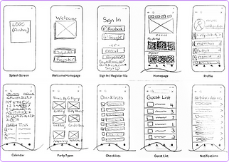
Sketching played a vital role in our design process in designing the party planning app, allowing us to quickly visualize ideas, test layouts, and turn research into concrete designs. Sketches of key screens provided a foundation for iteration and enabled early stakeholder feedback. We learned that sketching speeds up exploration, aligns stakeholders, and reveals design issues early, keeping the process flexible, efficient, and user-centered.


LOW FIDELITY WIREFRAMES
Creating low-fidelity wireframes taught us the value of early-stage planning. Wireframing allowed us to test structure and functionality, ensuring user needs were met efficiently and revealing design issues early for quick adjustments. This process set a solid foundation for a more accessible, user-centered final design.

DESIGN SYSTEM
The design system established a cohesive, user-friendly experience. By using a vibrant color palette, clear typography, consistent icons, and a structured grid layout, we created an engaging and organized interface. This approach emphasized simplicity and usability, giving users familiar cues for easier navigation. We learned that a consistent design helps create an enjoyable user experience.


GRIDS

ICONS


HIGH FIDELITY WIREFRAMES
The high-fidelity wireframes helped us confirm the app’s final look and functionality, showing that our design met user needs. We tested the user-friendly layout, smooth navigation, and key features ensuring a cohesive and vibrant design. This stage validated our approach, finalizing the app's polished and functional experience.


TESTING

TEST PHASE 1
KEY FINDINGS
-
Users find the app visually appealing and engaging.
-
The app is straightforward and easy to navigate.
-
Users wish the app had been available for previous events they planned.
-
Reviews, ratings, and sharing options are popular features.
USABILITY ISSUES
-
CRITICAL: Users found it challenging to locate the "Party Types" section.
-
CRITICAL: Users struggled to find the "Contacts" section.
-
MAJOR: The buttons within the "Checklists" section were confusing for users.
-
MINOR: Users were unsure how to close the slide-out menu.
-
NORMAL: An "edit" button is needed on the Calendar screen.
TEST PHASE 2
KEY FINDINGS
-
Users appreciate the clean, consistent color scheme.
-
Suggested adding an "Add a Contact" button to streamline contact management.
-
Users value familiar design elements similar to other Apple apps.
-
Some users mistakenly clicked “Start” instead of “Directions” for navigation.
USABILITY ISSUES
-
CRITICAL: Users need an easy way to return to the homepage to start planning or browse party types.
-
MAJOR: Add mile markers on the location screen for clarity.
-
MAJOR: The address for Marcella’s Donuts Bakery should link directly to the map.
-
MINOR: Split the Calendar by month to reduce scrolling.
-
NORMAL: Rename “Agenda” to “Itinerary” for clarity.
IMPROVEMENTS
Improvement #1: Simplified Checklist Buttons
-
Issue: Users found the checklist buttons confusing.
-
Solution: Buttons now fill with a checkmark when completed and stay empty if pending. Users can delete items by swiping left.
Improvement #2: Enhanced Contact Accessibility
-
Issue: Contacts were hard to locate.
-
Solution: Replaced the Favorites icon in the bottom navigation bar with a Contacts icon. Favorites are now under the Profile.
Improvement #3: Streamlined Account Registration
-
Issue: The homepage "Register for an Account" button was redundant and allowed users to exit without committing.
-
Solution: Removed the homepage button and made account creation a required first step.
Improvement #4: Clear Exit from Slide-Out Menu
-
Issue: Users struggled to exit the slide-out menu.
-
Solution: Added a traditional close icon for easy exit.
Improvement #5: Search Radius for Location Map
-
Issue: The location map needed a specific search radius option.
-
Solution: Added a slidable mileage bar to define the search area.

RESULTS
The redesigned application successfully addressed user needs, delivering an intuitive, user-friendly party planning experience. Key enhancements, including streamlined checklists, improved contact accessibility, and clearer navigation, greatly elevated usability and user satisfaction. Positive feedback and higher engagement with features like reviews and sharing confirmed the effectiveness of the redesign. These updates have created a seamless, enjoyable experience, empowering users to plan parties effortlessly and efficiently.
REFLECTIONS
In this project, I focused on a user-centered design, using research and testing to understand our audience’s needs deeply. This iterative process helped me refine the app to meet and exceed user expectations. Collaborating closely with stakeholders kept us aligned, which felt rewarding and key to our success. Seeing positive user feedback was incredibly fulfilling, validating the effort put into creating an intuitive experience. Moving forward, I’m excited to add new features and user-generated content to further enhance the app.