TESTING, ITERATION, REDESIGN

CLIENT
Be Uninterrupted
DATE
2024
ROLE
UI/UX Designer
Join an inclusive support system designed for professional women, offering actionable advice, reliable information, and a strong community. Uninterrupted future with the resources and connections you need to thrive.
TOOLS

PROBLEM STATEMENT
The website design is complete but unvalidated without user testing, risking usability issues. We'll conduct user testing, gather feedback, and refine the design to meet user needs and expectations.
DEFINE
TARGET AUDIENCE
-
Working Women of All Ages
-
Mothers Re-entering the Workforce
-
Women Changing Careers
-
Working Women with Health Issues
For the "Be Uninterrupted" launch, 3 focus groups gathered feedback on site sections, revealing usability and design improvements. This input helped refine the site’s appeal and functionality before launch.

"Be Uninterrupted" UI/UX Team


Focus Group 1 of 3
IDEATE AND DESIGN
During the ideation phase, the focus was on enhancing the Work-Life Plan section of the website, with several design changes to improve its appearance and usability.
SCENERIO #1
The navigation was improved by changing the left-hand vertical menu to a horizontal layout, following common web patterns. This enhances user flow, makes sections easier to find, frees up space, and provides a cleaner, more intuitive browsing experience.
Before

After

SCENERIO #2
The background was changed to white, giving the site a brighter, cleaner look. This improves readability and reduces clutter, helping users focus on content. The white background also highlights other design elements, creating a modern, professional appearance.
Before

After

SCENERIO #3
Aspirations were emphasized by switching from popups to a full-page layout, creating a more immersive experience. This allows users to engage more deeply with the content, reduces repetitive actions like closing popups, and makes information more prominent and accessible.
Before

After

SCENERIO #4
Cosmetic updates, like underlined links and a calendar popup, were added across the site to create a cohesive, polished user experience and simplify date selection.
Before

After

TESTING
The team conducted 3 focus groups using a guerrilla testing strategy, with team members assigned to specific site sections. Real user flow examples provided participants with a realistic experience. I focused on the Work-Life Plan section.


Focus group testing provided key insights into the strengths and improvement areas of the Work-Life Plan, highlighting both its potential as a productivity tool and opportunities to enhance the user experience, especially for new users.
WHAT WE LEARNED
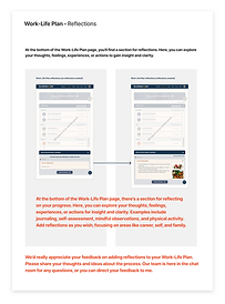
Focus groups revealed that users appreciated the goal-setting calendar and customizable categories in the Work-Life Plan but wanted clearer prompts and smoother navigation. The reflections section was valued for self-assessment, though first-time users needed more guidance. These insights will help us make the Work-Life Plan more intuitive and user-friendly.
AREAS TO IMPROVE
We learned that first-time users need clearer prompts, especially in reflections, to understand features better. Visual cues like icons would improve navigation, and a quick feedback option is needed for user input and issue reporting.
DASHBOARD
PROBLEM STATEMENT
After testing, the team and stakeholders agreed the dashboard needed a major redesign to improve visual appeal and meet user expectations. Key issues were low engagement, poor conversions, and an uninspiring design, highlighting the need for a vibrant, interactive update.
SOLUTION
The dashboard improvement plan includes vibrant colors, modern UI, better readability, and simplified navigation with clear calls-to-action. Interactive visuals, checklists, progress bars, reminders, and gamification will boost engagement. Key sections like tasks and events will be highlighted, white space will reduce clutter, and personalized content will enhance the user experience.
Before

After - V1 Muted Palette

After - V2 Dark Palette

RESULTS
The focus group liked the platform's intuitive navigation, clean design, and smooth transitions. They valued features like goal reminders, reflections for self-assessment, and personalized mentorship. However, they noted issues with inconsistent navigation, cluttered visuals, and limited mentorship customization. The dashboard redesign addressed these points with a vibrant UI, simplified navigation, gamification, and reminders to boost engagement. White space improved readability, and a feedback tool and personalized content enhanced satisfaction. Overall, these changes led to higher user interaction and better task completion.
REFLECTIONS
Reflecting on my work with Be Uninterrupted, I’m proud to have built a platform that supports productivity and balance. Designing a clean, intuitive layout with smooth transitions was challenging but rewarding. User feedback showed the importance of nudges, reminders, gamification, and balancing visual appeal with functionality. This project reinforced the value of continuous feedback, iterative improvements, and user-centered design. Though my contract has ended, I’m grateful for the experience and eager to apply these insights to future projects.